How to Make Party Flyers: Pro Tips for Eye-Catching Invites
Discover how to make party flyers that wow your crowd. This guide covers design tips, copy ideas, and visuals for your next event.
Making a great party flyer is all about nailing that perfect mix of key event details and a design so good it stops people in their tracks. It’s a creative process that starts with knowing who you're inviting, picking a theme that resonates, and then putting it all together in a way that gets people genuinely excited to show up.
Why a Great Flyer Is Your Event's First Impression
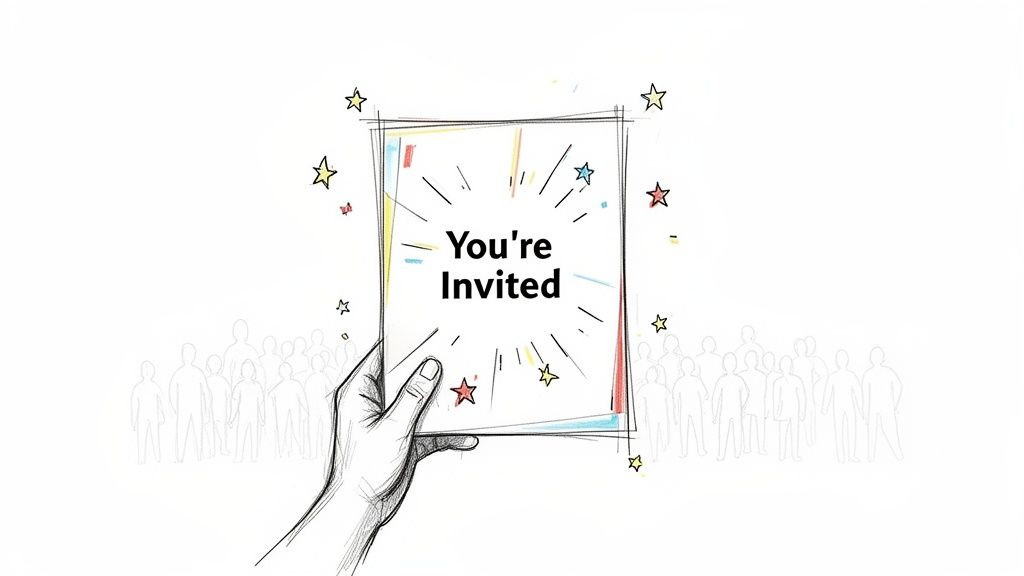
Before you even think about firing up a design app or choosing a color palette, let's get one thing straight: a flyer is so much more than just an announcement. It's the first taste of the experience you're planning. Think of it as the opening act for your main event.
A truly effective flyer doesn’t just spit out the date and time. It sets a mood. It builds real, tangible anticipation. This first impression is what turns a casual "maybe I'll go" into a definite "I can't wait for this!" Getting the visuals and words right is how you transform a simple invitation into a buzz-generating machine.
From Just Information to Real Excitement
The psychology here is pretty straightforward. People are drawn to things that feel special and look like they were made with them in mind. A boring, text-heavy flyer might get the basic info across, but it’s never going to create an emotional connection. And this is where modern creative tools give you a serious upper hand.
Forget scrolling through endless stock photos. Imagine using visuals that perfectly capture your party's unique theme. With AI tools, you can take photos of yourself or your friends and turn them into incredible cartoon or anime characters that match the vibe you’re going for. This isn't just a gimmick; it has real advantages:
- Creates Instant Intrigue: A custom cartoon of the host immediately stands out from the visual noise on social media feeds.
- Builds a Personal Connection: Seeing familiar faces in a fun, stylized format makes the invitation feel personal, not like a generic ad.
- Makes Your Flyer Shareable: Let's be honest, people are way more likely to share something fun and unique, spreading the word for you.
Your flyer is the single most important piece of marketing for your event. It’s the handshake, the welcome mat, and the sneak peek all rolled into one. Make it count.
This creative strategy is more relevant than ever. The global party supplies market, which depends on eye-catching promotion, was valued at US$15.9 billion in 2024 and is expected to hit US$39.2 billion by 2035. That massive growth just shows how crucial standout visuals are for throwing a successful party. You can actually explore more data on the party supplies industry and see these trends for yourself.
Laying the Groundwork for a Perfect Flyer
I know the feeling. You’ve got a party idea, and you’re itching to jump into a design app and start messing with cool fonts and splashy colors. But hold on. The secret to a truly great party flyer—one that actually gets people excited to show up—isn't about diving into design first. It's about planning.
Think of it as building a house. You wouldn't start throwing up walls without a blueprint, right? Taking just a few minutes to nail down the basics is what separates a flyer that gets ignored from one that ends up on the fridge.
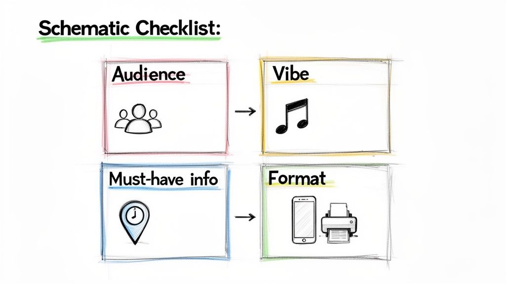
First Things First: Who’s Coming and What’s the Vibe?
Before you pick a single color, ask yourself: who is this party for? The answer changes everything. A flyer for a casual board game night with a few close friends should feel totally different from one promoting a huge public block party.
Then, zero in on the feeling you want to create. Is it a chill, acoustic backyard hang? A wild, all-night dance marathon? Your flyer is the first impression of your event, so it needs to scream that vibe from a mile away.
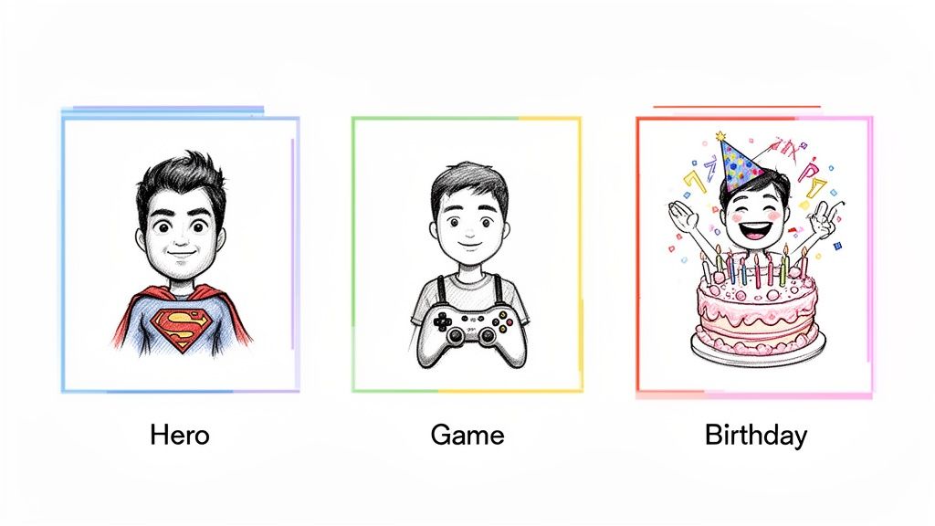
For instance, a kid's birthday party flyer would naturally lean into bright, fun colors and maybe some playful, custom characters. This is where an AI cartoon image generator can be a game-changer, helping you create the perfect little mascot for any theme imaginable.
Pinpoint Your Must-Have Information
Okay, now it’s time to get practical. Before you add a single graphic, grab a notebook and jot down every single piece of information your guests absolutely need to know. A forgotten detail is the fastest way to get a dozen "wait, what time again?" texts.
Your flyer's main job is to provide clarity, not create confusion.
Use this quick table to make sure you've covered all the non-negotiable details before you start designing.
Your Flyer's Essential Information Checklist
| Information Category | What to Include | Pro Tip |
|---|---|---|
| The "What & Why" | Name of the party/event and a short, punchy reason why they can't miss it. | Think of this as your headline. Make it catchy! |
| Date & Time | Full date (including the day of the week) and the start/end times. | Adding the day (e.g., "Saturday, Oct 26") prevents simple calendar mix-ups. |
| Location | The complete physical address. | If parking is tricky, add a note about it. A QR code to Google Maps is a nice touch for digital flyers. |
| RSVP Details | How and by when people should RSVP (e.g., text a number, click a link). | A firm RSVP deadline is your best friend for planning. |
| Special Instructions | Any dress code, theme, or note about bringing anything. | "Come in your best '80s gear!" or "Potluck-style, bring a side to share." |
Once you have this list locked in, you’ve already created a mental blueprint for your design. You know what needs to stand out.
Finalizing your core message first gives you a natural hierarchy for the design. It ensures the most critical info is impossible to miss, even if someone just glances at your flyer for two seconds.
Choose Your Format: Digital or Physical?
Finally, how are you going to get this flyer into people's hands (or onto their screens)? This decision shapes the technical side of your design from the very beginning.
-
Going Digital? If your flyer is destined for Instagram stories, Facebook events, or WhatsApp groups, you're designing for a screen. Think vertical layouts, bold colors that pop in a crowded feed, and file sizes that won't take forever to load.
-
Sticking with Print? For flyers you'll hand out or pin on a bulletin board, you need a high-resolution file built for standard paper sizes (like A5 or 8.5" x 11"). The design has to be clear and readable from a few feet away.
Deciding this now saves you from a massive headache later. With these key pieces planned out, you're officially ready to start the fun part—designing with purpose and confidence.
Creating Unique Visuals That Tell a Story
Alright, this is where the real fun begins. Your flyer’s visuals are the first thing anyone will see, and frankly, they’re the biggest factor in whether someone stops scrolling or keeps walking. A killer design does more than just look pretty—it captures the entire vibe of your party in a single glance.
Let's dig into what makes a flyer truly pop, even if you’ve never touched a design app in your life.
We're going to focus on creating a standout centerpiece, something totally unique that you just can't get from a generic template. This is where AI tools become your secret weapon, letting you craft visuals that are personal, memorable, and ridiculously shareable. Imagine a flyer for a superhero movie night featuring cartoon versions of you and your friends as the stars. Now that's a personal touch that gets people excited.
Mastering Layout and Hierarchy
Layout is just a fancy word for how you arrange everything on the page. The goal is to guide the viewer’s eye from the most important info down to the details. This is what designers call visual hierarchy.
Think about what someone absolutely needs to know first. It’s almost always the "what" and "when." Make that information the biggest and boldest thing on the flyer.
- The Main Event: Your party's theme or name should be the star of the show.
- The Key Details: The date, time, and location should be the next easiest things to find.
- The Fine Print: Things like RSVP details or "potluck style!" can be smaller.
A clean, uncluttered layout is always, always better than a busy one. Don't be afraid of empty space! It lets your key elements breathe and makes your flyer way easier to read.
The Secret Language of Color and Fonts
Color sets the mood instantly. Bright, vibrant colors scream "party," while darker, moodier tones are perfect for something like a Halloween bash or a more formal get-together. A simple trick I always use is to pick two or three complementary colors and stick to them. It keeps things cohesive.
Fonts have personalities, too. A playful, rounded font is perfect for a kid's birthday, while an elegant script might feel right for a dinner party. The golden rule? Limit yourself to two fonts: one for headlines and one for the body text. This keeps the design looking professional, not chaotic.
Your design choices aren't just decorative; they're storytelling tools. A bold, comic-book font and a primary color scheme instantly tell guests to expect a fun, high-energy event, long before they've read a single word.
Creating Your Custom Cartoon Centerpiece
Here’s how you can create an unforgettable visual that makes your flyer truly one-of-a-kind. Instead of grabbing a generic icon or stock photo, you can use a tool like Tooncraft to turn a photo of yourself, a friend, or even your pet into a fun cartoon character that fits your theme perfectly.
This approach transforms your flyer from a simple announcement into a personalized keepsake. Customization like this really pays off. Think about it: flyers with QR codes have seen engagement boost by up to 40%, and tools like Tooncraft can even help create scannable cartoon links for RSVPs. With over 239 million social media users in the US alone, a unique, share-worthy cartoon flyer can spread like wildfire and drive up attendance. The demand for unique visuals is a real trend, which you can read more about in the party supplies market.
And the best part? It’s surprisingly simple to do.
- Upload a Photo: Start with a clear, well-lit picture of the person (or pet!) you want to cartoonify.
- Choose a Style: Pick an art style that matches your party’s theme—maybe a classic comic book look, a cute Pixar-inspired character, or a cool anime hero.
- Generate and Place: The AI works its magic, and you get a custom image to download and drop right into your flyer design as the awesome centerpiece.
If you’re curious to see it in action, we have an in-depth guide on how to turn a photo into an illustration that walks you through every click. This is the kind of personal touch that makes an invitation feel less like an ad and more like a personal message—and that’s exactly how you make a party flyer that actually works.
Writing Words That Actually Get People to Show Up
Look, a killer design will stop someone in their tracks, but it's the words on the flyer that convince them to clear their schedule. Writing the copy for your party invitation isn't about being Shakespeare; it's about connecting with your future guests in a way that feels real and gets them genuinely excited.
Think of it this way: your writing voice needs to match the party's vibe. A flyer for a chill board game night should sound completely different from one for a wild 30th birthday bash. The words you pick are just as crucial as your color palette and fonts.
Your Headline is Your First Impression
The very first thing anyone reads is your headline. You have, maybe, three seconds to make them care. So, make it count. Don't just announce the event—give it some personality.
- Game Night: Instead of just "Game Night," how about "Get Ready to Roll! Board Games & Good Times."
- Birthday Party: Ditch "Sarah's Birthday Party" for something like "Help Us Celebrate Sarah Turning the Big 3-0!"
- Housewarming: "Housewarming Party" is fine, but "New Keys, Who Dis? Come See Our New Digs" is way more fun.
The headline sets the entire tone. A little creativity here makes your flyer feel less like an announcement and more like a personal invitation.
The All-Important Call to Action (CTA)
A great Call to Action does more than just ask for an RSVP. It should create a little bit of urgency and make it ridiculously easy for people to say "yes." Be clear, be direct, and tell them exactly what to do next.
Honestly, don't overthink it. The best CTAs are usually the simplest. Something like, "RSVP by Friday so we can get a headcount!" or "Just text 'I'm in!' to [Your Number]" works perfectly.
Make it frictionless. If you're sending a digital flyer, embed a clickable link to an RSVP form or a WhatsApp group. The fewer hoops someone has to jump through, the better your response rate will be. You're not just asking them to come; you're trying to build a little healthy F.O.M.O. (fear of missing out).
This mix of great visuals and smart copy is a potent combination. For example, recent marketing innovations have shown that data-driven targeting can boost campaign success by 25-35%. For your party, that just means pairing your fun visuals with words that speak directly to your friends. You can discover more about these marketing trends to see just how powerful this approach is.
Don't Make Them Hunt for the Details
Once you've hooked them with a catchy headline, you need to give them the essential info. The key is to present it clearly, without making the design look like a cluttered mess. I always recommend using bullet points or short, scannable lines for the core details.
- When: Saturday, October 26th from 7 PM 'til late
- Where: 123 Fun Street, Party Town
- What: Tacos, tunes, and terrible dance moves
- RSVP: Let us know by the 20th!
This format lets people digest the critical information in a split second. Nobody wants to read a whole paragraph just to find the address. Keep it clean, simple, and impossible to get wrong.
Sharing Your Flyer With the World
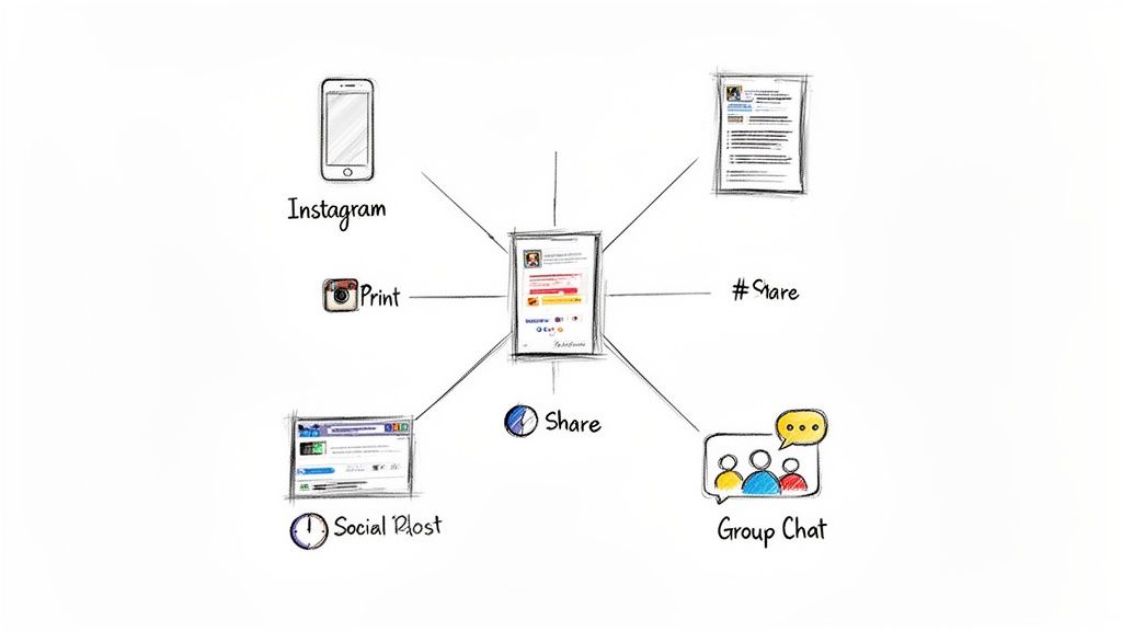
You’ve done all the hard work. The planning, the designing, the copywriting—it's all done. Now, that incredible party flyer is finally ready for its grand debut.
This last part is all about getting your masterpiece in front of the right eyeballs. We need to make sure it looks just as amazing on a glossy printout as it does in a quick text message. It's more than just hitting "send"; the technical choices you make right now will determine if your design looks crisp and pro-level or blurry and unreadable.
Choosing the Right File Type
When you go to export your design, you'll probably see a few options staring back at you: JPG, PNG, and PDF. They might seem like alphabet soup, but picking the right one is absolutely essential for making your flyer look its best.
Here’s a simple way to think about it:
- JPG (or JPEG): This is your best friend for anything digital. JPGs are the perfect balance of decent quality and small file size, which makes them ideal for dropping in a group chat, posting on social media, or attaching to an email. No one wants to wait for a huge file to download.
- PNG: Go with a PNG if your design has any transparency—like a logo that needs to float over a background. They hold up better than JPGs for graphics with sharp lines or text, but the trade-off is a larger file size.
- PDF: When it comes to printing, PDF is the undisputed champion. It’s like a digital time capsule, locking in all your fonts, images, and layout details so what you see on your screen is exactly what comes out of the printer.
A good rule of thumb: JPGs are for fast, easy online sharing. PDFs are for flawless, high-quality printing. Always match the format to your distribution plan.
Optimizing for Digital and Print
Okay, so you’ve picked a file type. Now you have to dial in the settings. A flyer made for an Instagram Story has totally different needs than one destined for a coffee shop bulletin board.
For Digital Sharing (Social Media, Texts, Email)
Clarity and speed are your top priorities here. A massive file will either take forever to load or get squashed into a blurry mess by social media apps.
- Resolution: Stick with 72 DPI (dots per inch). It's the standard for screens and keeps your file sizes nice and small.
- Color Mode: Always use RGB (Red, Green, Blue). It's the color language all digital displays speak.
- Dimensions: Size your flyer for the platform you're using. An Instagram Story needs to be 1080x1920 pixels, while a classic square feed post looks great at 1080x1080 pixels.
For Physical Printing
Quality is king when you're printing. You need a file that’s packed with enough information to create a sharp, vibrant physical copy that does your design justice.
- Resolution: Export at 300 DPI. This is the industry gold standard for high-quality printing and ensures you won't see any pixelation.
- Color Mode: Set this to CMYK (Cyan, Magenta, Yellow, Black). This is the four-color model professional printers use to mix ink.
- Bleed: This one is crucial. If your design has any colors or images that go right to the very edge of the page, add a 0.125-inch bleed. This is a small safety margin that gets trimmed off, preventing any ugly white borders from showing up.
Getting these settings right is the final polish that makes your hard work shine. And if you're looking to make your whole creative process smoother, check out our rundown of the best social media content creation tools.
Common Questions About Making Party Flyers
Even after you've dotted all your i's and crossed your t's, a few nagging questions always seem to surface right before you're ready to share your masterpiece. Don't worry, you're not alone! Nailing these final details is what makes your flyer truly effective.
Let's walk through some of the most common things people ask, so you can send that flyer out with total confidence.
When’s the Best Time to Send Out a Flyer?
This is probably the number one question I get. The honest answer? It really depends on the party.
For a casual get-together with your close friends, sending it out one to two weeks ahead of time is the sweet spot. But if you're planning something bigger, like a milestone birthday bash or a formal holiday party, you'll want to give everyone more of a heads-up. Aim for three to four weeks in advance for those larger events.
Giving people that extra buffer ensures they can actually clear their schedules. Plus, it gives you a more realistic window to collect RSVPs, which is a lifesaver for planning.
Should I Make Different Versions for Print and Digital?
Yes, you absolutely should! I know it sounds like a little extra work, but trust me, it’s a pro move that pays off. A design that looks amazing on an Instagram Story just won’t translate well to an 8.5x11-inch piece of paper, and vice-versa.
Think of it like this:
- For Digital: Your focus should be on eye-popping visuals and minimal text. Go with vertical formats (like 1080x1920 pixels) for Stories or square (1080x1080 pixels) for feed posts. And, of course, make sure any links you include are actually clickable.
- For Print: Readability is king here. You need high-resolution images (at least 300 DPI) so they don't look blurry, and your text needs to be big enough for someone to read from a slight distance.
Each version is tailored for where it's going to be seen, making sure it looks fantastic no matter what.
What if I Spot a Mistake After I've Already Sent It?
It happens to the best of us. That heart-stopping moment when you hit 'send' and immediately see a typo in the address or realize you put the wrong start time. The first rule is: don't panic. The key is to be quick and clear.
Just send a follow-up message to the exact same people or platform. Start with a really obvious subject line like "CORRECTION" or "Quick Update!" to make sure it gets noticed. Then, just state the correct info simply.
Quick Update! The party starts at 8 PM, not 7 PM. So sorry for the mix-up—can't wait to see you all there!
This approach is direct, solves the problem instantly, and keeps the vibe positive. People will appreciate the fast clarification. Getting good at making flyers is a process, and learning to handle the little bumps with grace is all part of it.
Ready to create visuals that will make your party the one everyone talks about? With Tooncraft, you can turn your photos into awesome cartoon and anime-style characters that fit any party theme. It’s time to ditch the boring templates and make an invitation that truly stands out. Try Tooncraft today and bring your party vision to life!